

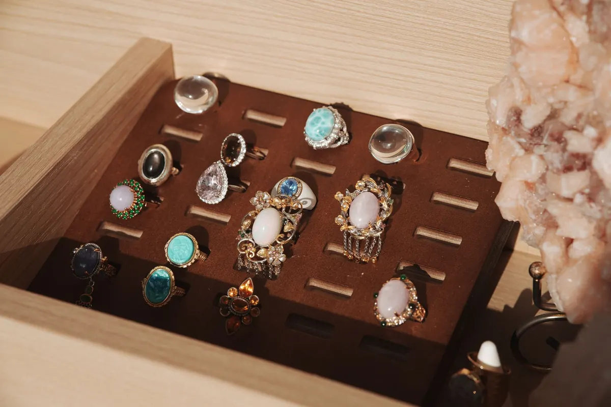
A tray of loose opals can look like a handful of captured weather. Then you read the labels — white, black, boulder, crystal — and the vocabulary stops matching what your eyes are doing. None of those words describes the colours flashing inside the stone. They describe the ground those colours appear against, and what that ground is made of. Learn that one idea and the categories stop feeling arbitrary, which is exactly what you want when you are choosing a first piece or reading a listing online.
A Type Is a Description of the Background
Precious opal is mostly silica and water, and its colour comes from structure rather than pigment: microscopic spheres of silica stacked in a repeating grid bend light into the flash we call play-of-color. That flash shifts with the angle of the light and the angle of your eye, which is why a photograph never quite settles the question of what a stone looks like. A stone that seems dull in one image can be startling in person, and a stone that looks spectacular on a screen can turn out to be mostly a single hard glare.
Body tone is the steady part — the background colour you see when you hold the stone flat and ignore the flash. Traders describe that background on a numbered scale running from near-black to white, and the four names you meet most often are shorthand for a body tone plus the material the opal grew in. Contrast does the rest of the work. A bright green flash looks lively on a pale background; the same green on a dark one looks lit from inside. This is why two stones with similar colour can feel completely different in the hand, and why the category name is only the beginning of the conversation.
It also helps to separate body tone from brightness. A white opal can have a brilliant, rolling flash, and a black opal can be relatively subdued until it is moved into better light. Neither quality is automatically better than the other; they are different effects. The category tells you what kind of stage the colour is performing on, not how good the performance is.
White Opal: The Classic Starting Point
White opal, sometimes called light opal, has a milky or pale body, and the play-of-color appears to float on the surface. Most of it comes from South Australia — Coober Pedy is the name you will see most often, with Mintabie and Andamooka behind it — and it makes up a large share of what is sold worldwide. Cutters usually shape it into cabochons, often with a low dome, because a thin, even layer of colour is what the rough tends to give them. A low dome also keeps more of the colour layer in the finished stone, which matters when the opal seam is only a few millimetres thick.
For a beginner, white opal is the most forgiving place to start. It is generally the least expensive of the four types at a comparable quality level, so you can learn what you actually like without treating the purchase as a commitment. Silver and white gold keep the pale look coherent. The exception worth paying attention to is a white opal with a strong red flash: red is the rarest colour in the opal spectrum, and it stands out sharply against a light body. A small white opal with a clear red-orange flash can be more interesting than a much larger stone with a broad but faint green sheen.
White opal is also a good type for experimenting with shape. Because the material is more plentiful than black opal, cutters can afford to make oval, round, teardrop and freeform cabochons without treating every millimetre as a crisis. If you are drawn to a simple pendant or a pair of everyday earrings, this is the category that gives you the most choice at the least risk.
Black Opal: Dark Ground, Strongest Contrast
Black opal has a dark body — deep grey, charcoal, navy, occasionally almost black — and the finest material comes from Lightning Ridge in New South Wales. It is the rarest of the four types and the one that sets records at auction. You do not need the price history to see why: on a dark background, a green-blue flash reads as electric, and a red flash looks lit from within. Many black opals sit quietly in a dim room and then flare when you carry them to a window.
A practical note for first-time buyers: “black” refers to the background, not to the stone’s overall appearance. Plenty of good black opals read as mid-blue or teal until the light catches them. Because the material is precious and often thin, these stones are usually set in a bezel or a well-protected prong setting, and yellow gold or black rhodium are common choices — both keep the eye on the flash rather than the metal. A bezel also hides the edge of the stone, which is useful when the opal layer sits close to the surface.
Black opal rewards slow looking more than almost any other type. Turn the stone under a lamp, then take it away from the lamp. Look at it against a dark cloth and against your hand. The best pieces do not depend on one dramatic angle; they keep giving you something as the stone moves. That quality — sometimes called “life” by traders — is hard to measure and easy to recognise once you have compared a few stones side by side.
Boulder Opal: Formed in Ironstone
Boulder opal grows in thin seams and small cavities inside ironstone, almost all of it in Queensland. Quilpie, Winton, Koroit and Yowah are the names that come up. Rather than cutting the ironstone away, cutters leave it attached, so the finished stone is part opal, part host rock. That produces freeform shapes, sometimes a natural dome of brown ironstone backing a ribbon of colour, and occasionally a piece such as a Yowah nut, where the opal sits inside a nodule like a small geode.
The result looks nothing like a neat oval cabochon, which is precisely the appeal. Boulder opal is the type to look at if you want something that could not be mistaken for anything else: a pendant cut to follow the seam, a ring with a landscape in it, a stone whose brown ironstone edge becomes part of the design. Ironstone does not scratch easily, but the opal itself is often a thin line near the surface, and a hard knock can still chip the face. If the piece will be worn often, choose a setting that sits the stone slightly below the line of the metal.
Boulder opal is also a useful reminder that “cut” does not always mean “shaped into a standard outline.” A good boulder cutter works with the rough rather than against it, following the colour where it goes. That is why two boulder opals from the same field can look completely unrelated, and why buying one is often a matter of responding to the stone as a small object rather than comparing it on a chart.
Crystal Opal: See-Through Stone
Crystal opal has a transparent to semi-transparent body, so the play-of-color seems suspended inside the material rather than resting on it. Turn one over and you will often see the pattern from the back as well, sometimes in different colours. The transparency makes the flash look denser and more saturated, and it also means the stone picks up whatever sits behind it: an open-back setting shows that quality off, while a closed backing changes the character of the piece entirely.
Two origins matter here. Ethiopian opal from the Wollo region is largely crystal material, often with a vivid, confetti-like pattern, and much of it is hydrophane — it can absorb water, look temporarily clearer or cloudier as it dries, and should never be soaked. Mexican fire opal is a different animal: an orange-to-red body, sometimes with play-of-color, usually faceted rather than cabbed. Faceted crystal opal makes a lovely accent stone, but in a ring it wants a bezel or a recessed setting rather than tall prongs that catch on a sleeve.
Crystal opal can be especially beautiful in earrings and pendants, where light can pass through from behind. In a ring, the same stone may look darker or more muted because your finger blocks the light. If you are comparing a loose crystal opal with a finished piece, try to see it in the kind of setting you intend to wear. The difference can be considerable.
How to Compare Stones in Real Life
Once you know the four categories, the next skill is comparison. A few simple habits will tell you more than any label:
- Use neutral light. Daylight near a window is ideal. Warm shop lighting can flatter red and orange flashes; cool lighting can exaggerate blue and green.
- Move the stone, not just your eyes. Play-of-color should shift as the angle changes. A pattern that only appears from one precise direction is less versatile in wear.
- Look at the back. Crystal opal may show a second pattern; boulder opal should show ironstone; a black opal’s dark backing should look natural rather than painted or glued.
- Check the setting. A thin opal in a tall prong setting is more exposed than the same stone in a bezel. Ask how the stone is protected, not just how it looks on the display card.
- Ask about origin and treatment. Reputable sellers should be willing to tell you where the opal came from and whether it has been treated, backed or assembled into a doublet or triplet.
It also helps to compare stones of the same type rather than jumping between categories. A white opal and a black opal are playing different games. Judge each one by the contrast, pattern, brightness and condition it brings to its own category.
Care and Buying Notes for a First Opal
Opal is softer than quartz and much softer than diamond, so it rewards a little forethought. Store opal jewellery separately from harder stones, and avoid ultrasonic cleaners and steam cleaners, which can be too aggressive for opal and for the settings around it. Warm water, a soft cloth and mild soap are usually enough. Ethiopian hydrophane opal needs extra care: do not soak it, and avoid wearing it during swimming, washing up or any activity that leaves it wet for long periods.
When you are buying, decide first what role the stone will play. A pendant or earring can carry a more delicate crystal or white opal because it is less likely to be knocked. A ring for everyday wear benefits from a protected setting and a stone with a secure edge. Boulder opal can be rugged because of its ironstone host, but the opal face still needs protection. Black opal is best bought slowly, with a return policy and a clear photograph in neutral light.
Treat the category as the opening sentence, not the whole story. The stone in your hand still has to earn its place through colour, pattern, condition and the way it behaves when you move.
That is the useful shift for a beginner: white, black, boulder and crystal are not grades, and they are not colour names. They are quick ways of saying what kind of ground the flash is growing from. Once you can see that ground clearly, the labels become a map rather than a mystery — and you can start choosing the opal that suits the way you actually wear jewellery.
Photo: 光术 山影 / Pexels